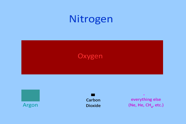
But, in my opinion, it stops too soon - there are a couple of images missing.
Before continuing with this page, I strongly suggest studying the UCAR page and see what you think. Then continue here to see what I think the issues are.
The basic model
600 * 400 = 240,000 pixels 600 * 400 * 0.0004 = 96 pixels for CO2 @ 0.04 % (400ppm) |
They then display this in two different ways.

Lets show some water vapor
How much CO2 is there in the atmosphere? |
What is the effect of humans adding more CO2 to the atmosphere? |
So, it is easy to criticize others, but what would make this better?
One possibility would be to draw water vapor across 60% of the image at the correct height and then show CO2 at the same height - for a fair comparison.
So, using the same 600 by 400 rectangle to represent the atmosphere,
600 * 400 = 240,000 pixels 600 * 400 * 0.02 = 4,800 pixels H2O @ 2% 600 * 400 * 0.0004 = 96 pixels CO2 @ 0.04% (400ppm) 60% of the width is 600 * 0.6 = 360 4,800 / 360 = 13.33.. pixels high for H2O 96 / 13 = 7.38 pixels wide for CO2 at the same height |
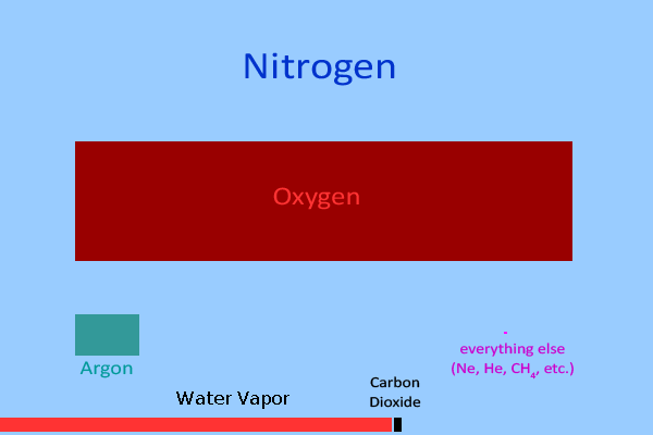
Why 60%? - Its just a swag. The atmosphere is not 100% IR opaque due to water vapor and clouds, and clouds cover about 50% of the surface. So I picked a number - other numbers might be better. To get a better comparison, the actual absorption values might be used.
According to the energy balance diagram by Kiehl and Trenberth (1997 - via IPCC AR4), of the estimated 390 W/m^2 emitted from the surface, 350 W/m^2 are absorbed by the atmosphere - 89.7% is absorbed.
(Kevin E. Trenberth (USA) and Philip D. Jones (UK) were the lead authors for "Climate Change 2007: Working Group I: The Physical Science Basis")
89.7% of the width is 600 * 0.897 = 538.2 pixels wide (4,800 + 96) / 538 = 9.1 pixels high 4,800 / 9 = 533.33.. pixels wide for H2O 96 / 9 = 10.66.. pixels wide for CO2 at the same height |
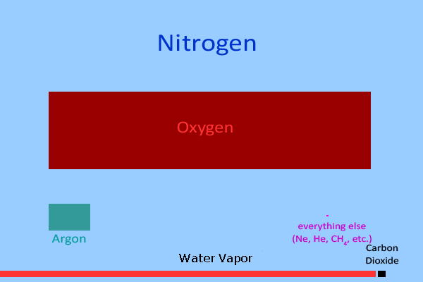
In this case, the width of the bars approximates the amount of IR energy absorbed by each constituent. (See the spectra overlap discussion below.) The blue gaps indicate the amount of energy escaping directly to space - about 10% of the total emitted by the Earth.
Another way to display this would be to make the CO2 bar 4 pixels wide (to represent 400ppm) and then compute how wide a water bar of the same height would be.
96 / 4 = 24 height of CO2 4,800 / 24 = 200 width of H2O @ 2% |
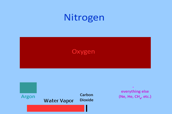
I like this image since it makes it easy to visualize that each additional 100ppm of CO2 increases the width of its bar by only one pixel.
Comments
In all 3, water vapor is set to 2% of the atmosphere. Their page states that water vapor normally varies from 1% to 4%, and, with the images above, the reader can mentally cut the displayed value in half, or double it, as appropriate.
In my opinion, these images clearly show that adding more CO2 to the atmosphere is totally insignificant, mainly because the natural variation in water vapor is so much larger than the amount of CO2 added by humans.
On the other hand, in the stratosphere, water vapor is typically below 5ppm and CO2 (at 400ppm) is the major IR active gas. At that altitude, changes in CO2 are very significant. But that isn't the "Anthropogenic Global Warming" argument.
The UCAR page doesn't mention the fact that the relative amount of water vapor decreases with altitude. In fact, the 1% to 4% values are only for the lower troposphere - the part from the surface to around one kilometer above it. Above that, the amount (the mixing ratio) decreases significantly.
Near the surface, the water vapor and CO2 spectra overlap. As a result, it would be more accurate to represent about half of the CO2 absorption (bar width) as being absorbed by water vapor. Since the amount of overlap is a complex function of temperature, pressure, and mixing ratio, above some point, those two spectra no longer overlap. I have that programmed into my models, but it is too complex to show in these images.
Since the majority of the rest of the atmosphere is IR transparent, with respect to "global warming", it is irrelevant (except for the 0.4 pixel for methane - CH4). (Nitrogen, oxygen, argon, neon, helium, krypton, and hydrogen don't absorb or emit IR energy at the frequencies emitted by the Earth's surface.)
Note that adding water vapor to the images should reduce the amounts of oxygen, argon, and carbon dioxide displayed. However, since the amount of water vapor varies significantly with altitude, and because this is for instructive purposes only, I have not made those adjustments.
Venus
Adding CO2 to the atmosphere will make us just like Venus |
For a column of air between the surface and space, the temperature and pressure vary with height. To simplify the analysis and to make comparisons easier, it is convenient to determine how long a horizontal tube at a single temperature and pressure would need to be to hold the same amount of air that actually exists in vertical column. I have selected STP (standard temperature and pressure) as Earth sea level and 15°C. (There are actually many definitions of STP.) Based on these calculations, at STP, a horizontal tube about 5.3 miles long will hold the same amount of air as the entire amount of air above that point, assuming the same cross sectional area. (Of course, the temperature will cause the length to vary a lot.) For a column of atmosphere on Venus, if placed in a similar hypothetical tube on Earth, also at sea level and 15°C, the tube would be about 324 mile long. Since the Venusian atmosphere is about 96.5% CO2, just the CO2 part of that column would be about 312 miles long. Taking a ratio indicates that the amount of CO2 on Venus is about 58.9 times the entire atmosphere on Earth.
Using the diagrams above, and assuming that the CO2 bar for Venus has a width of 600 pixels (the width used for the total Earth atmosphere), the height of just the CO2 would be 400 * 58.9 = 23,560 pixels. Assuming that 400 pixels (the height of the images above) is about 3.6 inches (will most likely be different on your display),
312 miles / 5.3 miles = 58.8679 ratio of the amount of CO2 on Venus to the total atmosphere of Earth 400 pixels * 58.9 = 23,560 pixels 23,560 pixels * (3.6 inches / 400 pixels) * (1 foot / 12 inches) = 17.67 feet |
To be clear, Venus has a lot of CO2.
In my opinion, this simple example explains why we seldom hear that "we will be just like Venus" anymore - with the notable exception of Stephen Hawking.
Feedbacks
It is frequently argued by those that believe in Anthropogenic Global Warming caused by increased CO2 that
Since we are here, that is not how the system works. Stable systems, like the ones that support life, exhibit a strong "negative feedback" where any change in a forcing causes something that tries to reduce the forcing. If we assume that the sun affects the temperature
In the images above, water vapor is shown as about 2% of the atmosphere. In reality, it varies locally from about 1% to 4%, with the higher amounts being in the hottest locations - a very strong correlation. However, it should be obvious from the image where water vapor is about 90% of the image width that doubling the amount of water vapor in the atmosphere will not cause 180% of the available energy to be absorbed. Instead, the increase is only about 9%. But, because the water vapor and CO2 spectra overlap, the total increase is actually only about 7% since the water vapor is now absorbing radiation previously absorbed by CO2. (The 9% and 7% values are from a program I wrote. There are a lot of assumptions in those calculations that are beyond the scope of this article - some of which I know are bad. However, I don't expect the relative values to be significantly different from those.)
So what actually happens is that there may be a small increase in the energy stored in the lower atmosphere, but, due to convection and clouds, there is a very significant increase in the heat released to space from the tops of those clouds. These Atmospheric Heat Pipes produce a very strong negative feedback. (Hint - deserts are hot because there is no water to evaporate.)
Comments
One of the common skeptic arguments is that water vapor has a much larger effect on the climate than CO2. To bury a comment about water vapor in the text, but to then leave it out of the images ... Well, that is why I consider their page to be propaganda. Nothing in it is actually wrong (or un-scientific), but it intentionally creates a misleading impression of the importance of CO2.
At any rate, to me, that omission IS un-scientific propaganda.
The same goes for Venus - if you are explaining how much CO2 is in the atmosphere, then how about putting it in context with the once common claim that "we are going to be just like Venus"?
And they call me unscientific and despicable.
Perhaps this should be filed under - Lying with the Truth!
Author: Robert Clemenzi